David Bowie’s five worst album covers
Few artists can boast as many groundbreaking, revolutionary albums as David Bowie. From his glam rock early days to the profound existentialism of his final release, Blackstar, the Brixton-born songwriter crafted some of the most enduring and prolific moments in musical history. Despite his artistic sensibilities, the ‘Starman’ had some pretty mediocre album covers across his discography.
It goes without saying that David Bowie created some of the most iconic albums of all time, and that reputation often stretches to the album’s cover artwork. Records like Low, Aladdin Sane, and The Rise and Fall of Ziggy Stardust and the Spiders From Mars boast artwork that is instantly recognisable and integral to the history and lineage of rock and roll music. After all, so much of Bowie’s appeal was rooted in visuals. His boldly androgynous image, grandiose stage outfits and ethereal makeup were almost as essential to the songwriter’s revolutionary reputation as his songwriting itself, particularly during those early days.
Still, it is fair to say that Bowie had his fair share of misses, too. Once the songwriter established his output as being of an incredibly high standard, that standard became difficult to match, especially given Bowie’s personal struggles with addiction during the early half of his career. Inevitably, this led Bowie’s quality control to slip on a number of occasions. While it is easy to criticise the music on albums like Never Let Me Down or his 1967 self-titled debut, some of the songwriter’s album covers have been just as disappointing.
With 28 studio albums released during his lifetime, not all album covers are created equal. Some are more equal than others, however. While the likes of Low and Aladdin Sane might reflect one end of the spectrum, the opposing end is chock-full of album covers that were disappointing, bizarre, or have aged incredibly poorly. So, join us as we count through five of the worst offenders.
David Bowie’s worst album covers, ranked:
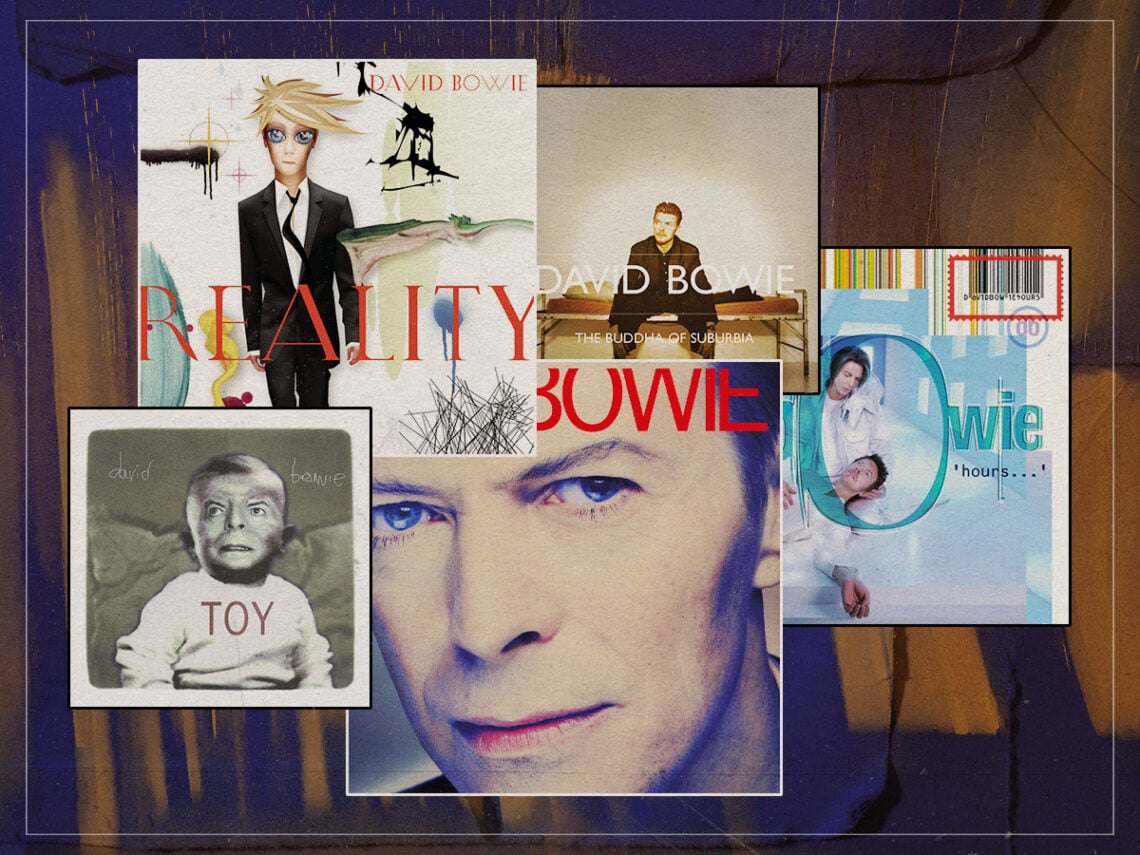
Black Tie White Noise (1993)

Released in 1993, Black Tie White Noise was a pivotal record in the discography of David Bowie, marking a triumphant comeback following the intense disappointment of 1987’s Never Let Me Down. Although the final album is hardly Bowie’s best, it certainly contains moments of genius, and his covers of tracks like ‘Nite Flites’ remain woefully underrated gems within his repertoire. However, if the album was intended as a big comeback, why is the album cover so oppressively boring?
When you are a musician who delivered truly timeless, beautiful albums like Low or even Scary Monsters, passing off an album cover as bland as Black Tie White Noise becomes much more difficult. Featuring an extreme, uncomfortable close-up of Bowie’s face, taken by photographer Nick Knight, the various after-effects put onto the image only make matters worse. His eyes seem to follow you around the room, and Bowie’s strangely confrontational expression means the cover is best kept face down when putting the record onto your turntable.
Hours (1999)

The early days of the Internet produced no end of aesthetic tragedies, and Bowie’s 22nd studio album is certainly no exception. Depicting a youthful, long-haired Bowie cradling the seemingly dead short-haired Bowie, the album artwork – much like the record itself – was reportedly inspired by Christian imagery, most notably the Pietà, which sees the Virgin Mary cradling the dead body of Jesus Christ.
While Bowie’s decision to depict himself as both Jesus and Mary of Nazareth is certainly a strong choice, it is the artistic style of the album cover which makes it such an eyesore. Opting for a bright blue and white colour palette, the album evokes a clinical feeling, evocative of the opening of Casualty, but this is flanked by a busy collection of different fonts and a seemingly superfluous collection of coloured bars at the top of the cover, which also features a prominent barcode. Maybe it has aged badly, or perhaps it has always been difficult to look at.
The Buddha of Suburbia (1995)

Soundtrack albums typically feature images or posters taken from the film or television series in which they originated, but that is, regrettably, not the case when it comes to The Buddha of Suburbia. Originally released in 1993, the album features music from the original four-part BBC series, in addition to new material created by Bowie inspired by the show. It was largely ignored upon its release and has not received a wealth of attention since. That first pressing featured artwork from the series, but a 1995 reissue updated the artwork to feature a banal image of Bowie sitting on a bed, looking off into the middle distance.
That updated album cover isn’t offensive or disgusting, it’s just so boring. It is no surprise that this is one of Bowie’s most ignored releases, because the album cover in no way invites audiences to put it on. A basic white font overlayed on a pretty terrible photograph of the songwriter; the album cover looks as if it was created by a middle-aged office manager on Microsoft Word for a self-released CD.
Toy (2021)

Released posthumously in 2021 and consisting of re-recorded versions of old Bowie tracks from the 1960s and 1970s, Toy is something of an outlier on this list. Still, it technically counts as a studio release, and Bowie himself planned to release it as far back as 2001. Now that the formalities are out of the way, let’s discuss the absolute monstrosity that features on the cover of the record. The cover is centred around a black-and-white image of adult David Bowie’s face superimposed onto what appears to be infant David Bowie.
The immediate reaction to this cover – apart from averting your eyes – is to attack Warner Music Group, who finally released the album in 2021, for commissioning such a grotesque image. In actuality, though, the album cover is based upon an artwork created by Bowie himself, which featured in a 2009 edition of Lemon Magazine. Whether or not Bowie intended the artwork to end up as an album cover or not, it is certainly the most bizarre album cover to feature in his discography.
Reality (2003)

“What is that?” is the only appropriate response upon seeing the album cover of Bowie’s 2003 record Reality. A busy collection of nonsensical graphics on a plain white background, the cover looks like the product of a child let loose on MS Paint. Of course, the focal point of this nightmarish artwork is the depiction of Bowie himself, who is seen wearing a black suit and rendered in a horrific anime-esque digital art style befitting of Deviantart-style fan-fiction.
The album itself is much better than it is often given credit for, but it is no surprise that many listeners don’t bother to listen to it, given the early-Internet anime nightmare splashed across its cover. Not only is the album cover Bowie’s absolute worst, but it is also one of the worst album covers ever published. Bowie was always keen to embrace new technologies, but if the Reality cover is what the digital age had in store, it is a wonder he didn’t write it off there and then.