The Cover Uncovered: The hazy timestamp of Arctic Monkeys’ artwork for ‘AM’
Stand at any bar on West Street in Sheffield for long enough, and eventually, you’ll spot a sleeve riding up as someone reaches for their pint, a wrist turning, or a forearm catching the light to reveal a simple waveform tattooed in black ink.
More than a decade after its release, the cover of Arctic Monkeys’ AM remains one of the most recognisable images in modern British music, and much like the tongue-and-lips logo of The Rolling Stones or Joy Division’s pulsar lines before it, Alex Turner’s monochrome squiggle has escaped the confines of the record sleeve and permanently inked itself onto the skin of popular culture.
The album itself was every bit as slinky as the waveform that came to define it. Long gone were the sheepish lads tripping over their two-sizes-too-big Converse and legging it from taxis at red lights, and in their place, fresh from a recording stint in America, Arctic Monkeys sauntered back into the spotlight in 2013, smelling of hair pomade, clad in leather and brandishing AM, a record dripping with nocturnal swagger.
For some fans, that Americanisation initially felt worlds away from Sheffield’s grey industrial grit, but as Pulp had proved years earlier with Different Class, longing after dark is a universal language. Fluorescent takeaways, cheap drinks and late-night yearning can become cinematic in the right hands, and Arctic Monkeys simply translated those same feelings into something sleeker, slower and slightly less gangly.
The influence behind AM’s groove-heavy swagger had always been there. Turner and drummer Matt Helders bonded as teenagers over hip hop just as much as indie, obsessing over artists like Dr Dre, Outkast, Wu-Tang Clan and Roots Manuva, and on AM, this finally bubbled to the surface. Arctic Monkeys knew they weren’t making a cult record anymore, this record was designed to be huge: a late-night album with arena-sized confidence, and what better way to underline that than naming the record after themselves?
Some fans initially scoffed at the title’s apparent lack of imagination, but in an interview with Zane Lowe on BBC Radio 1, Turner revealed the title was at least slightly more deliberate than it first appeared, a nod to The Velvet Underground’s 1985 compilation VU: “I actually stole it from The Velvet Underground, I’ll just confess that now and get it out of the way. The VU record, obviously […] Did we cop out? Yeah! Summat about it feels like this record is exactly where we should be right now. So it felt right to just initial it.”

As it turns out, the title could easily have been something else entirely. Turner later revealed to NME that the band had considered calling the record The New Black, after a battered amplifier that became central to the recording sessions: “I got this old Rickenbacker thing that we recorded a lot through. There’s no knobs, just two holes. And this little black amp that became known as ‘The New Black’. Crossed me mind to call the album that.”
Though perhaps ‘The New Black’ sounds a bit more artistic, the title AM does carry more meaning than it first presents. Having contributed vocals to the record, Queens of the Stone Age frontman Josh Homme immediately picked up on the title’s second meaning, describing it as “a really cool, sexy after-midnight record” before adding, “It’s called AM, so I guess that’s really obvious”, except, at least to this writer, it wasn’t obvious at all, which perhaps says more about me than it does the title.
Until hearing Homme spell it out, it had never occurred to me that AM wasn’t simply shorthand for Arctic Monkeys but a reference to those strange, suspended moments of the early hours that the album inhabits from beginning to end. On ‘Why’d You Only Call Me When You’re High?’ you can picture Turner staring into a bathroom mirror at three in the morning, delivering himself a slurred pep talk while the room gently tilts beneath him, making AM a hazy timestamp and ultimately the emotional landscape of the entire record.
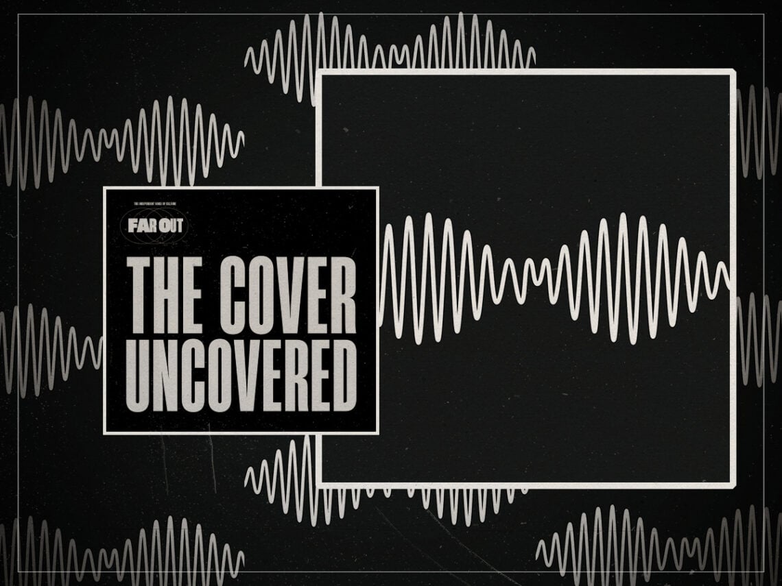
The minimalist black-and-white cover for AM was designed by Matthew Cooper, working from an original sketch by Alex Turner himself, which at first glance seems almost absurdly simple, involving a single white waveform stretched across a black background; but the graphic also resembles an amplitude modulation radio signal, a neat visual echo of the album title, while subtly spelling out the letters ‘AM’ within the middle of the wave itself.
The video for the single ‘Do I Wanna Know?’ turned that artwork into motion, which saw a black screen punctured by pulsing white lines that writhe and transform in time with the music. At times, they mimic vibrating guitar strings, at others, they become silhouettes, figures and fantasies emerging from the darkness, and that stark black-and-white aesthetic was spread across the rest of the album’s visual identity too.
From the smoky monochrome of the ‘One for the Road’ video to the hip-hop-inspired parental advisory graphic that flashes at the start of ‘Arabella’, everything felt part of the same world. Few albums of the 2010s arrived with such a fully realised visual identity, and it undoubtedly helped AM become one of the decade’s defining records, on the nose as it was.
And for anyone worried that Turner had abandoned his Sheffield humour in favour of Californian cool, he eventually offered the perfect deflationary reading of the cover when speaking to First Avenue magazine, stating, “It kind of looks like a bra”.