
10 hilariously bad album covers that should be deleted from history
Even the biggest names of the rock and pop canon can unleash a howler of an album cover.
It’s a pitfall that can befall any artist. No matter their stature, regardless of how glittering their oeuvre stands, a million things can go wrong in the art department, as you’ll discover perusing our list of record sleeve shockers. Zero budgets, dodgy fashion trends, ensnared by the brief spell of technology, or an act’s apathy as to what’s plastered across their LP effort to the wider world.
Sometimes it’s all just a horrible accident. An album’s artwork can often be out of a band’s hands, outsourced to the label’s in-house creative team or elsewhere and said band presented with the final result to their potential horror. If you’re massive, you may be able to demand a do-over, but otherwise, that’s your lot.
Whatever the reason, and however the mishap was spectacularly galumphed into, we take a look at the album covers so unbelivably awful that a reissue creative makeover is due pronto.
10 album covers that should be deleted from history:
Lady Gaga – ‘Born This Way’

Release Date: May 2011 | Producer: Lady Gaga, Fernando Garibay + more | Label: Streamline
After the ostentatious chic of her 2008 debut, The Fame, fans around the world were at a fever pitch, ready for Lady Gaga album number two. It’d arrive three years later, heralding her blustering land back on the album charts via the cheap and wholly unstylish cover of 2011’s Born This Way.
Perhaps that was the point, to flex a counter to the postmodern aura played with on the former’s pop examination of fame, but Gaga’s bad Photoshop weld to a motorbike lacked any sophistication the pop giant had established for herself only several short years previous, whacking a didgy chrome titles on Born This Way that feels lifted straight from WordArt.
Aretha Franklin – ‘Hey Now Hey (The Other Side of the Sky)’

Release Date: June 1973 | Producer: Quincy Jones and Aretha Franklin | Label: Atlantic
Soul queen Aretha Franklin never truly boasted fantastic album covers – the litany of records gifted to the Atlantic label during her classic heyday, growing in stature, supported by the weight of her gospel R&B material, despite the humdrum covers typically plastered on her original output.
Yet, it’s hard to see what anyone was gunning for on Hey Now Hey (The Other Side of the Sky). Matched with its lukewarm reception, Franklin’s 1973 LP effort features a pootly scrawled profile of the Tennessee heavyweight, afforded extra bewilder with its upside-down mini illustration of Franklin in the middle of her face. Nothing about Hey Now Hey (The Other Side of the Sky) works, and looks destined for the thrift store were it not for the legacy of her soul canon by the early 1970s.
Ozzy Osbourne – ‘Down to Earth’

Release Date: October 2001 | Producer: Tim Palmer | Label: Epic
It’s the last real Ozzy Osbourne album, in that it came out when he was still the Prince of Darkness rather than the MTV star confused by his TV remote in the eyes of the public. Boasting the hard-driving ‘Gets Me Through’ and ‘Dreamer’s snowswept balladry, it’s likely that Down to Earth stands as a bit of a chapter mark in the eyes of longtime fans.
Shit cover though. Rather than evoking its intended demonic entity martyred to the cross of the netherworld, Down to Earth just looks like a Photoshop error, a confused, digital mash of various concept art accidentally smashed onto the same save file, and the team just shrugging their shoulders.
Emerson, Lake & Palmer – ‘Love Beach’
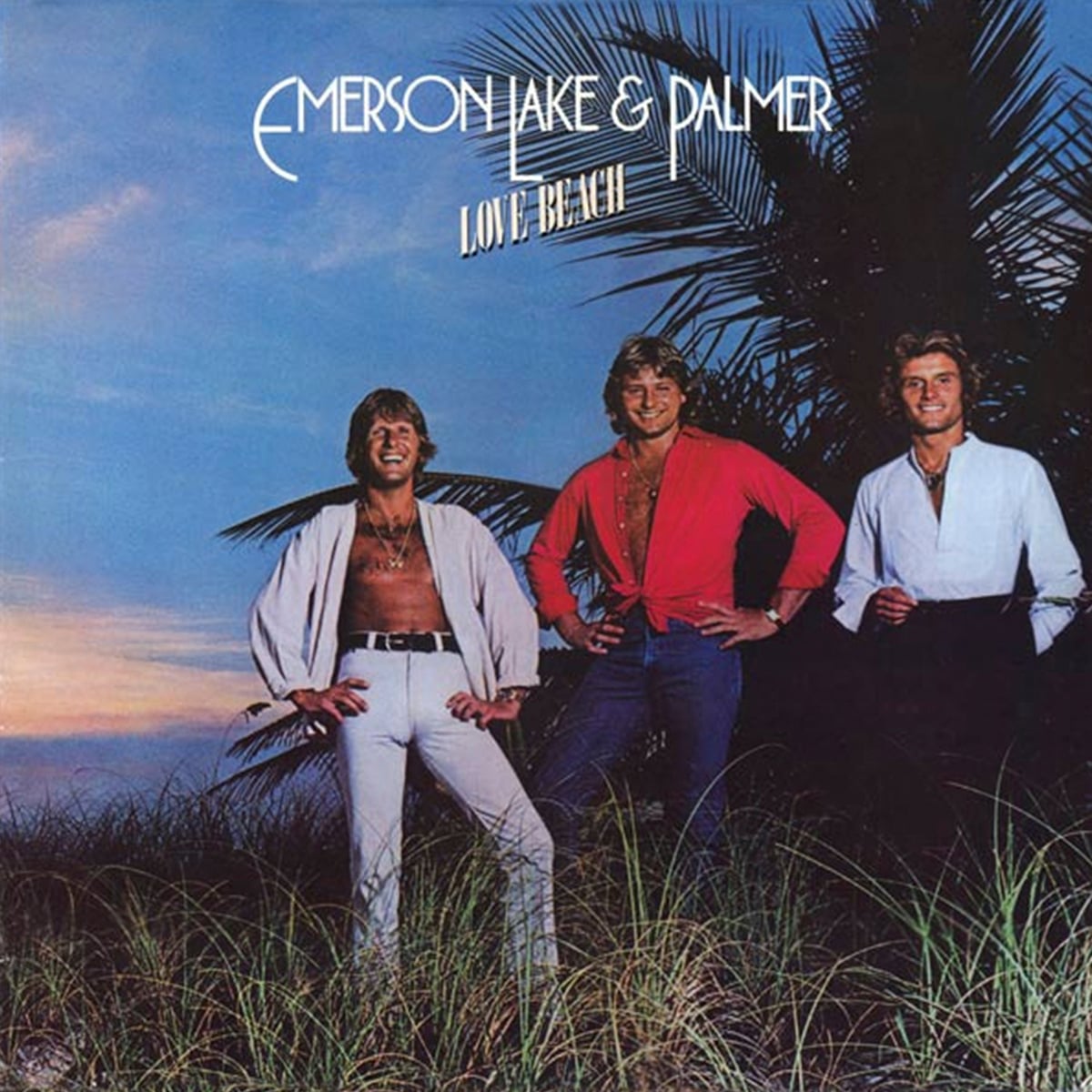
Release Date: November 1978 | Producer: Keith Emerson | Label: Atlantic
You just can’t trust those grins. Far from the sun-kissed, happy exteriors beaming with disquiet on Love Beach, the Emerson, Lake & Palmer trio were in dire straits. Prog’s standing had taken a battering in the wake of punk, and an exhausted ELP hauled themselves to the Bahamas to cut the final album of their initial tenure with the pressure weighing down heavily to ‘go commercial’.
It’s hard to understand Love Beach’s gobsmackingly awful cover. Looking more like Typically Tropical than the band responsible for Tarkus, the lads’ last record of the 1970s smacks of pain and desperation, a band smarting from their former proggy hubris and trying to laugh off their creative nadir, convincing no one.
The Rolling Stones – ‘Dirty Work’
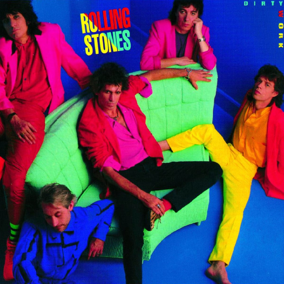
Release Date: March 1986 | Producer: Steve Lillywhite and The Glimmer Twins | Label: Rolling Stones Records
It’d been a good decade since their peak rock and roll mythos, but no surer sign that The Rolling Stones were well past their prime had been plumbed than on Dirty Work’s atrocious cover. It was a time of internal fracturing, when Mick Jagger and Keith Richards’ relationship had reached its lowest ebb and the whole band was rarely present together during its sessions.
The 1980s, as a pop cultural byword for flashy excesses, can often be labelled lazily, but Dirty Work’s a perfect time capsule of all that was gaudy during the decade’s horror fashion trends. Dispelling with all their rock gravitas, the clearly narked Stones decided to don garishly cheap clobber and still look miserable amid the loud colour scheme, symbolising the entire 1960s generation’s confused and blinkered stumble into the MTV era’s cultural upheaval.
Ministry – ‘Relapse’

Release Date: March 2012 | Producer: Al Jourgensen and Samuel D’Ambruoso | Label: 13th Planet
They used to wield some of the finest album artworks in metal across their 1980s and 1990s heyday. But, a fatigue with the Ministry juggernaut, founder and frontman Al Jourgensen unleashed on the industrial world, triggered a series of lower-tier records in the early 2010s that lacked sonic inspiration or much of anything to say.
Such apathy informed Relapse’s garish front cover. Doing away with all the dark humour and striking surrealism that clouded earlier LPs so thrillingly, Ministry’s 2012 reheat instead plaps a drunken oaf with whited eyes on the cover with zero finesse or ambiguity, reflecting the lukewarm mistread the record sits in Ministry’s otherwise glowing oeuvre.
Queen – ‘The Miracle’

Release Date: May 1989 | Producer: Queen and David Richards | Label: Parlophone
You can’t blame them. With digital photo editing just entering the creative horizon, Queen saw an opportunity to illustrate their new, simple Queen crediting throughout The Miracle’s songwriting and co-production with the embrace of the then state-of-the-art Quantel Paintbox system to realise a cutting-edge image, marking their newfound creative balance.
Quite quickly, Photoshop would become the industry standard, and Queen’s digitally morphed quad face of all members would soon lose its pioneering fascination and instead highlight how the eager play around with the Paintbox came at the expense of any remote creative idea. Once the tech demo wore off, The Miracle’s gaudy mushed-face aged like milk and stood as the rock behemoth’s daftest covers by a country mile.
Ted Nugent – ‘Scream Dream’
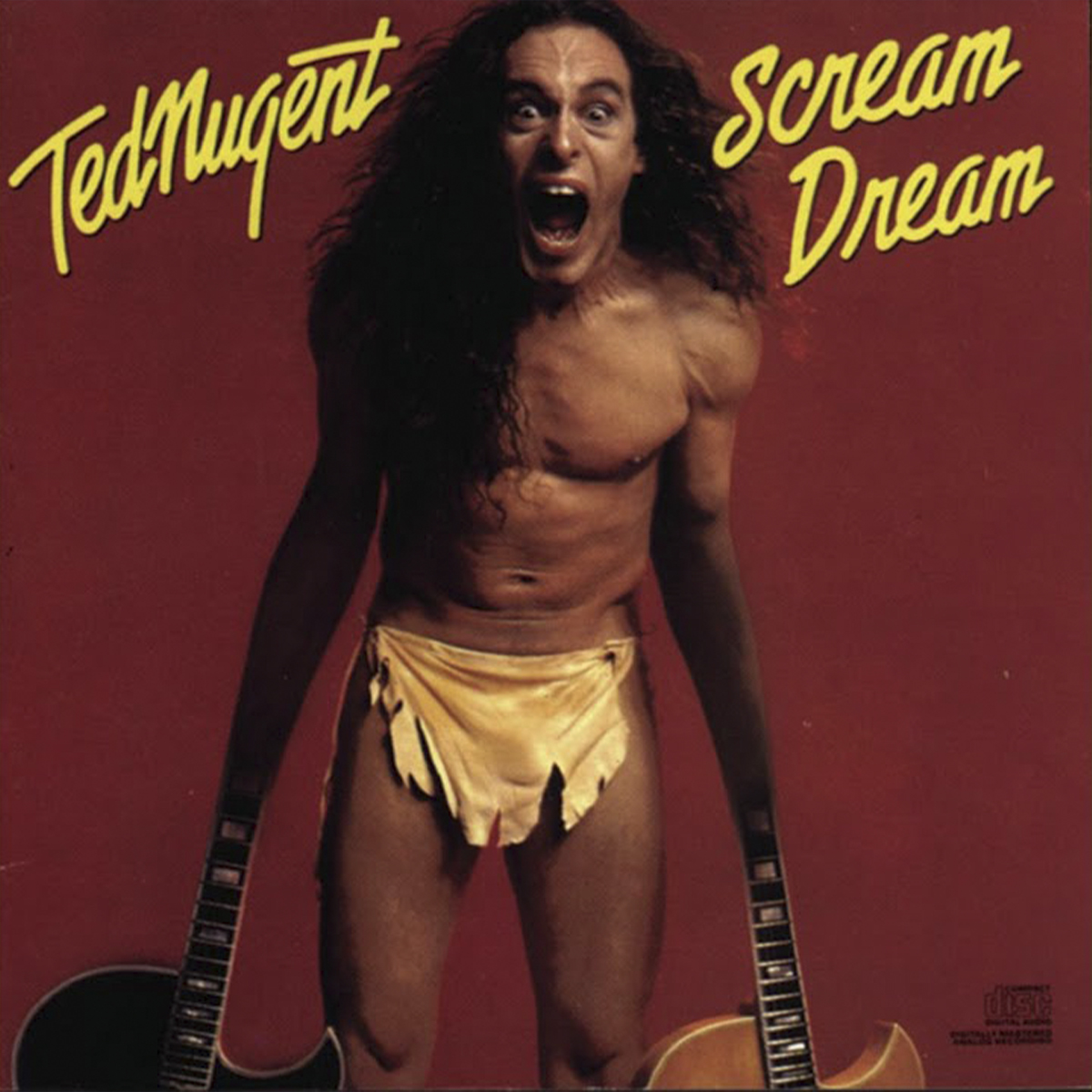
Release Date: June 1980 | Producer: Cliff Davies, Ric Browde, David McCullough, and Lew Futterman | Label: Epic
Sometimes, you really get the impression that an album’s artwork was the faintest afterthought, as if the Epic label’s art department was handed the album title a day or two before pressing. “Scream Dream? OK, team, we need an orange backdrop, a loincloth, and we’ll figure out something to do with The Nuge’s hands later, hurry!”
Perhaps it’s some kind of illustration of a feverish nightmare that afflicted Ted Nugent during his transformation from long-haired rocker to Republican dingbat, but 1980’s Scream Dream screams tacky and cheap, failing to illicit a laugh from its absurd cover and the guitars for hands rendering the whole bad joke inexplicable as well as embarrassing.
Anthrax – ‘Fistful of Metal’
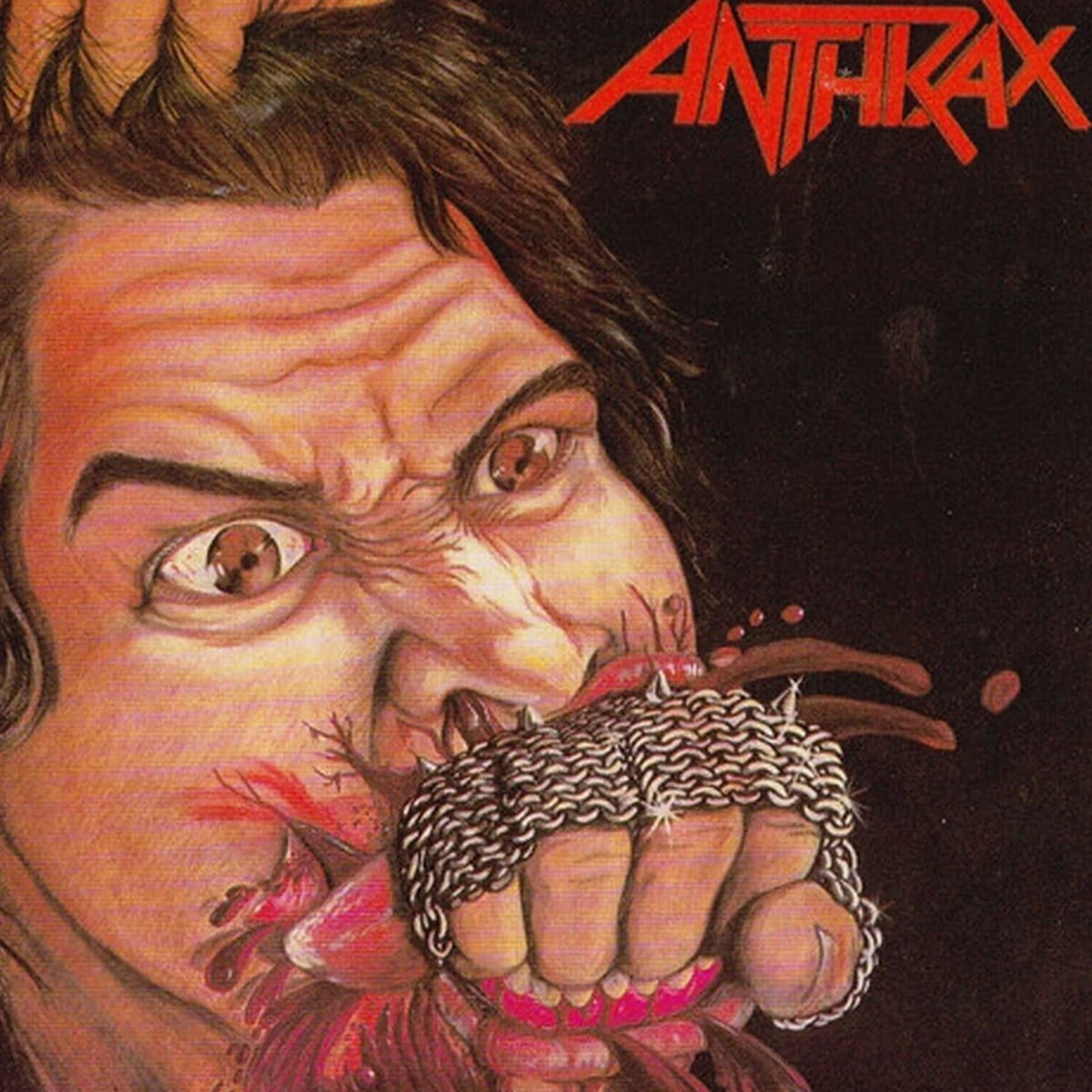
Release Date: January 1984 | Producer: Carl Canedy | Label: Megaforce
Having designed their spiky logo, there was no reason to think the same artist couldn’t also capture Anthrax’s impact on the New York metal underground with an equally hard-hitting cover? He’d followed original vocalist Neil Turbin’s art direction, chiefly a face receiving a bloody smack to the mouth with a knuckle-dustered fist, but the end result was a godawful misfire.
There isn’t a shred of danger to 1984’s Fistful of Metal, marking a limp unleash to the world just as thrash was beginning to seize the metal world in earnest, radiating all the energy of a rushed art-school project from a surly younger brother let loose with his crayons. “The cover was all wrong, but we didn’t have the budget to do anything else,” guitarist Scott Ian confessed in 2014’s I’m the Man.
Black Flag – ‘What The…’
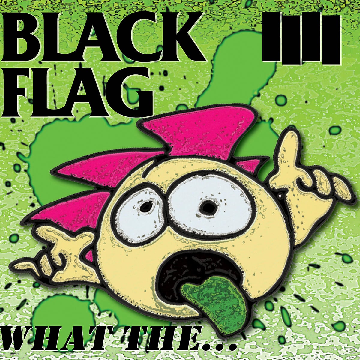
Release Date: November 2013 | Producer: Gregg Ginn | Label: SST
They boasted some of the greatest album sleeves in punk history. The younger brother of guitarist and principal songwriter Greg Ginn, Raymond Pettibon conceived of some of the DC hardcore legends’ most subversive and eerily ironic comic artwork, Family Man, In My Head, and the Six Pack EP, all suitably arresting images burned into Black Flag’s bruising landscape.
Returning with original vocalist Ron Reyes behind the mic, the frontman also brought his creative skills for the cover of 2013’s What The…, forgoing all of Pattibon’s acerbic critique for a bafflingly silly cartoon gonk poking its green tongue out in jest like a South Park rip-off that even the day’s pre-teen fans would have found juvenile. It’s hard to know what the Black Flag team were thinking, but it’s a sorry blot on the punks’ otherwise biting, visual identity.