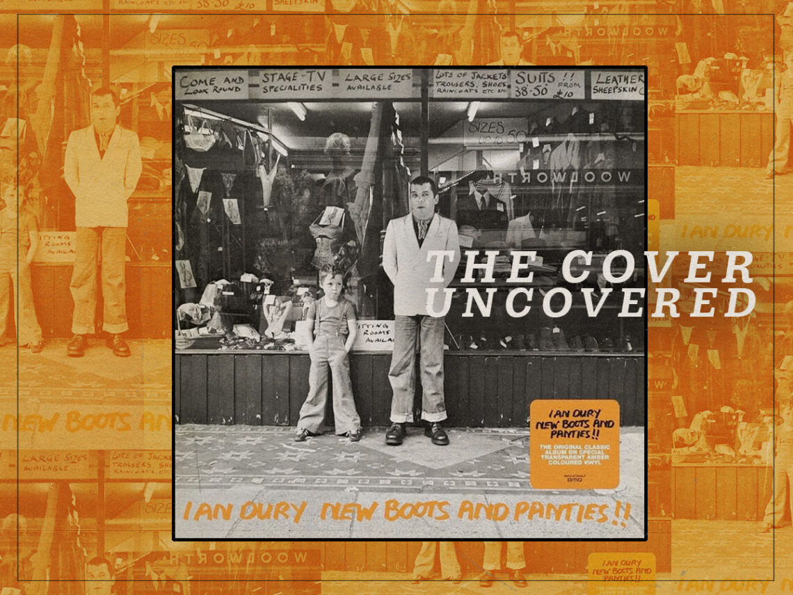
The Cover Uncovered: The iconic family photo cover of ‘New Boots and Panties!!’ by Ian Dury & The Blockheads
A truly unique and refreshing slice of British punk rock, Ian Dury and the Blockheads’ debut album, New Boots and Panties!!, is a criminally underrated record despite having been an influential touchstone and catalyst for a change in the direction of punk. Given that Dury was adamant that his singles and albums should be kept separately, the notoriety that he received for tracks like ‘Sex & Drugs & Rock & Roll’ and ‘Hit Me With Your Rhythm Stick’ were never translated to the reception that his albums received, only achieving modest sales upon its initial release.
Its colourful portrayal of working-class life in Britain and frequently coarse lyricism were what grabbed the attention of listeners, and its incorporation of funk, punk and music hall styles was a combination that shouldn’t have worked, but was a glorious revelation that led to other groups adopting a similar style in the subsequent years.
While the album is full of complex wordplay and tight musicianship, Dury specifically wanted the album cover to be a no-nonsense affair, and he and photographer Chris Gabrin decided not to approach it with any particular style or theme in mind. At the time of the photoshoot, no title had even been agreed upon – Gabrin was simply invited to Dury’s flat in Kennington to shoot whatever he felt. The lack of budget that Dury had played a big part in this approach, as he’d not been massively successful prior to this point, and Stiff Records weren’t able to provide a huge amount of financial backing for something so elaborate.
However, after Dury and Gabrin had been toying with various ideas at home, Dury decided that they should venture to a department store that he’d become acquainted with thanks to artist Peter Blake. They travelled down to Axford on Vauxhall Bridge Road, with Dury’s six-year-old son, Baxter, in tow. When they arrived, the shop front had been stocked with a display of women’s lingerie, which eventually inspired Dury to come up with the title.
While an album photoshoot might not be the best environment for an easily bored youngster to be spending an afternoon, it was Baxter who ended up unwittingly saving the photoshoot. In an interview with The Guardian in 2005, his son, the singer, revealed the version of events that he remembers. “The recollection I have of that day is that he said: ‘I’m getting my picture taken. Come along with me.’ Being bored, I went. I walked into the shot and said: ‘Can we go now?’ There were four frames taken, and he decided it would become the album cover.”
Baxter also noted his unusual fashion choice for the album cover, where he’s wearing flared dungarees and what appears to be football boots. However, this slapped-together style couldn’t have been a better representation for the album itself; a portrait of British working-class culture that feels ramshackle in every sense.
The family photo aspect of things can also be tied into the themes of family and heritage that are explored across the record, with Ian paying tribute to his own father in the witty ‘My Old Man’, and referencing several places in Essex, where he grew up, in ‘Billericay Dickie’. Yes, some of the other themes on the record are a little crass and vulgar for a family listening session, with special mention going to the opening lines of ‘Plaistow Patricia’ (“arseholes, bastards, fucking cunts and pricks”), but Baxter was surely exposed to this kind of X-rated language from a young age, and it’s certainly something that he’s adopted in his lyrical vernacular.
Gabrin recalled that when he returned home with Dury, there were only 24 exposures taken in total, and that Baxter was indeed only in four of them. “As soon as the films were developed, Ian came round and we immediately chose the same shot. We were so excited by the picture that we went straight into my darkroom and made the first print.”
Even the title of the album, which is scrawled over the front in permanent marker, was done in something of a hurry, considering the name of the album was made up off the cuff. The do-it-yourself aesthetic is so typical of the working-class punk style, and the scene that it paints, while so ordinary, is reflective of the equally unpretentious and unassuming lives of both the artist and the listeners who would have been able to relate to it. It’s such a simple album sleeve, but its impromptu nature and raw depiction of a father and son ended up being one of the most iconic sleeves of the 1970s.