‘Jokerman’: does Bob Dylan’s song have anything to do with the font?
Fonts and typefaces are hugely important to musicians, and their use in the artwork and designs used by bands and artists is crucial to helping them establish an image for themselves. If you take one look at a band’s logo, then you’ll recognise that a designer had to go to the effort of designing a specific font that was suitable to be used across album sleeves, tour posters and merchandise. If you were to show me or any other hardcore fans the ‘B’ in The Beatles or the ‘R’ in Radiohead without context, I think I’d immediately know where they’d been taken from, and that’s all down to excellent design work.
The range of different fonts available to us is extraordinary, and while some are used primarily for ease of legibility and professionalism, others are designed to be more whimsical or rooted in the need to add a bit of flair. The context in which they are used can dramatically alter how you perceive the text beneath it, and you’d probably not be able to take these words seriously if they were written in the child-friendly Comic Sans as opposed to the plain yet elegant typeface you’re presented with.
However, how important is music to the world of fonts? You might be thinking that while one offers a great deal of value to the other, the exchange of worth is not reciprocated and that there’s no possible way that musicians could have anything to give back to the typographers of the world, but there’s at least one font that many have long speculated might hold a deep connection to a classic song.
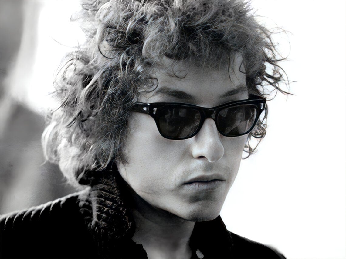
Taken from Bob Dylan’s 1983 album, Infidels, the song ‘Jokerman’ saw the folk icon turn his hand to a reggae-inspired sound that turned many heads, but that ended up being one of the most beloved songs from a dismal period in his career. On the other hand, the ‘Jokerman’ font is a lighthearted design that features lettering that is not decorated with your standard serif but instead has some playful-looking decals that make it jump out in signage. It certainly wouldn’t look appropriate in this headline, but it would make one hell of an impression if you were to see it on the page among these minimalist alternatives.
Are ‘Jokerman’ the song and ‘Jokerman’ the font connected?
On the surface, it would seem that there’s little to link the two, but thanks to the word of the font’s creator, Andrew Smith, and the intense digging done by a notable fan of both the song and font in Vampire Weekend’s Ezra Koenig, we received an answer to this incredibly important question in 2018.
Koenig had been developing a fascination with the font and its appearance in cafes, hairdressers, and other shopfronts in New York. He had been inviting listeners of his Apple Radio show Time Crisis to send in instances of Jokerman’s use in the wild to him to amass a collection. Around the same time, Vampire Weekend also performed a cover of Bob Dylan’s ‘Jokerman’ at one of their live shows, showing his appreciation for the track.
In order to understand the font’s history, he invited its creator, British designer Andrew Smith, onto his podcast to divulge more information on how he came to create the font and confirm whether it took its name from the song or if it was coincidental. Smith, who seemed somewhat bemused at the idea of being invited to talk about his creation to a rock star, eventually confirmed that there was a link between the two.
“Yes, it is,” Smith explained. “I’m a big Bob Dylan fan, and I wanted to pay tribute to him. I like the song, and I thought that it’s quite a funky name, and it goes with the style of the font, so you’re right, it is from the Bob Dylan song.”
Smith went on to explain that he initially designed the font while working for Letraset in 1995, where he made typefaces for dry transfer lettering and then digitised them. It was later adopted by tech company Microsoft, which has included Jokerman as one of many available fonts in their Office suite and other Windows programs.
It isn’t just Dylan that Smith is a fan of, though. He also expressed on the radio show that he has created other fonts that pay tribute to icons of music and cinema. One of his other creations is a cursive font known as ‘Goo Goo Gjoob’, which was inspired by John Lennon’s line in ‘I Am The Walrus’. The font ‘Chiller’, which is best known for its eerie horror aesthetic, took inspiration from Smith’s love of Alfred Hitchcock films.
It’s a bizarre and tenuous link, but a satisfying one to realise that one of the most immediately recognisable typefaces takes its name from one of Bob Dylan’s more unusual songs. When asked by Koenig if he knew whether Dylan was aware of the connection, Smith simply replied: “I haven’t heard from Bob’s people if he likes it or if he’s seen it, but it’d be nice to know.”
Never Miss A Tale
The Far Out Bob Dylan Newsletter
All the latest stories about Bob Dylan from the independent voice of culture.
Straight to your inbox.