How the 1960s got its iconic psychedelic look
While every decade has a recognisable aesthetic – we associate bell bottoms with the 1970s and neon hues with the ’80s – the ’60s was arguably the most culturally important decade. Young people were yearning for newness and innovation, which set off a cultural chain reaction that has defined the way we consume art ever since.
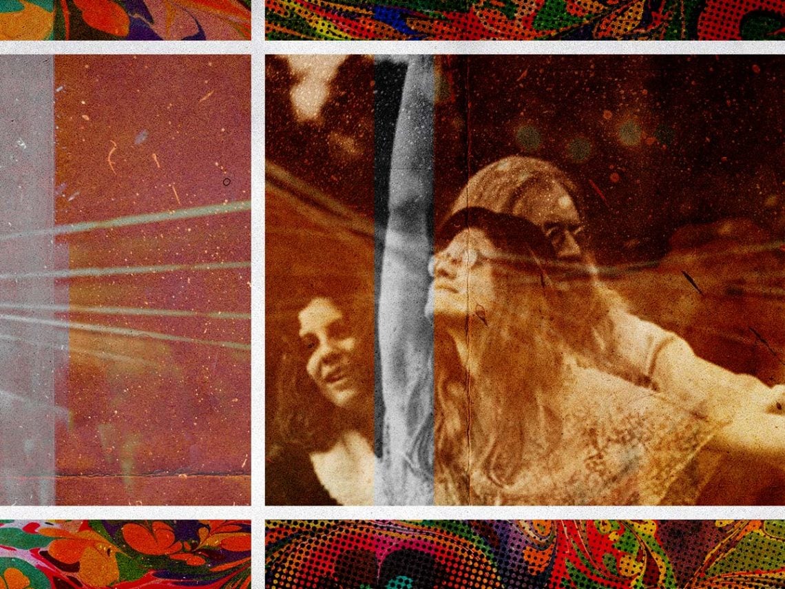
The ’60s was a time of significant social upheaval, with the civil rights movement and second-wave feminism gaining prominence. As wars raged on, nuclear disarmament also became an important issue, inciting many protests and cries for peace. Meanwhile, music and art reacted to these events inventively. The hippie movement dominated the American counterculture, and free love, acid experimentation and psychedelic music became defining features of the era.
The Beatles were quick to experiment with Eastern instruments, such as the sitar, crafting a psychedelic sound, which was hugely influential. However, psychedelic rock became closely associated with the American West Coast, where bands such as The Doors, The Grateful Dead and Jefferson Airplane championed the sound. Music lovers and acid experimenters gathered at gigs and festivals to catch their favourite artists or simply enjoy a psychedelic trip aided by the sound of reverberating guitars.
Yet, without social media to spread the word, posters and advertisements became essential for showcasing upcoming performances. The artists commissioned to create these posters wanted the visuals to be as bold as the music being advertised. Thus, they focused on bright colours, ambiguous bubbled lettering, seductive women, swirling lines and shapes, and floral imagery. Much of these aesthetic choices reflected the era’s preoccupation with freedom and experimentation – the bright, kaleidoscopic visuals mirroring a drug trip.
Even those without an interest in psychedelic music can infer what these posters are advertising; the highly recognisable aesthetic is intrinsically linked to the ’60s hippie era. However, the style actually emerged decades prior, during the late 1800s. The art nouveau movement, particularly popular in the Belle Époque period, was a reaction against industrialisation and technological advancement.
Many artists wanted aesthetic beauty to triumph, so they infused decor, furniture, advertisements and more with extreme decadence, drawing on swirling flowers, pastel hues and intricate patterns.
One of the most prominent artists from this period was Alphonse Mucha, whose pieces are some of the most recognisable from the movement. Much of his work inspired ’60s graphic designers like Wes Wilson and Bonnie MacLean, who reworked his style into something more colourful and visually stimulating. Vibrant hues and large abstract letters displayed information on the latest gigs and albums, often leaving fans squinting to work out the exact details of the advertisement.
The art nouveau style was the perfect fit for these psychedelic posters, both visually and historically. Just as these artists in the late 1800s reacted to cultural shifts, the musicians and artists who defined the psychedelic ’60s were using their crafts in an unprecedented response to rapid change.