How Robert Rauschenberg inspired the Talking Heads
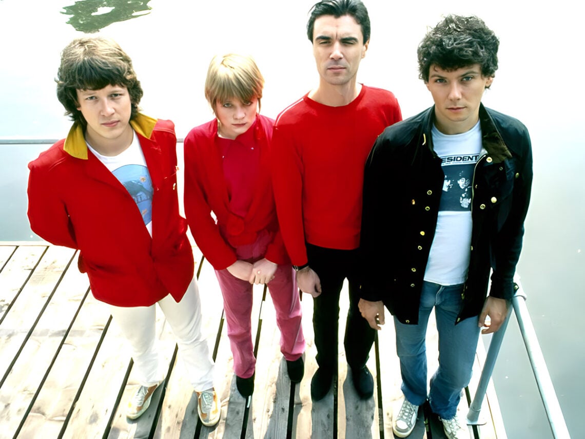
Talking Heads’ fifth album Speaking In Tongues saw the band blend funk, art-pop, new wave and post-punk in a fun-filled LP that featured their only top ten track, ‘Burning Down The House’. Combining Tina Weymouth’s groovy basslines, David Byrne’s bizarre, nonsensical lyrics and lively percussion, Speaking In Tongues is Talking Heads’ most dancey, summery, feel-good album.
Reflecting on his work, Byrne spoke about the process of writing the hit track’s quirky lyrics during an interview with the Wall Street Journal, recalling: “There are no hidden meanings. There’s no logical, linear connection. They aren’t telling a story or signifying anything. I simply combined aphorisms and nonsequiturs that had an emotional connection.”
In the same interview, Talking Heads and Tom Tom Club drummer Chris Frantz also notes the influence of Parliament and Funkadelic on the album’s groove and funk elements.
The 1983 album release formed the basis for the iconic ‘Stop Making Sense’ tour and its accompanying live concert film a year later. With Byrne’s iconic big grey suit and jaunty dance moves, Stop Making Sense went on to become one of the most celebrated live music films of all time.
The colourful, interactive LP cover that accompanied the album was perfectly in line with its optimistic sound and live performance. With that, the band commissioned American painter Rauschenberg to create the cover art, who spent three years designing the packaging for the LP.
Rauschenberg was known for his politically charged pop art using a range of materials – from painting to printmaking. Similarly, experimental and multi-talented artist David Byrne first stumbled upon his art at the Leo Castelli Gallery, where he approached Rauschenberg about working with them on Speaking In Tongues.
The concept saw the artwork put onto 12” circular transparent collages in three different colours in a clear case. Listeners would need to rotate the different moving parts of the product to see the images. Such a unique album demanded equally unique artwork, and Robert Rauschenberg didn’t disappoint.
In the New York Times, Byrne suggested that Rauschenberg had “eschewed simply reproducing a work on the album jacket in favour of re-envisioning what the whole LP package could be,” he said. “One could never see all the full-colour images at the same time, as Bob had perversely scrambled the separations.”
Rauschenberg’s original contribution to the album won it a Grammy for ‘Best Album Package’. Its colourful, playful design perfectly encapsulated the feel of the album sonically.