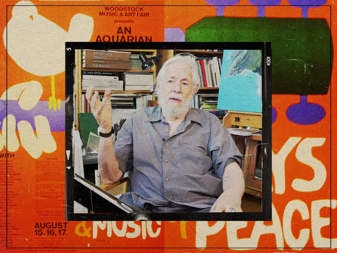
Arnold Skolnick: The man behind the iconic Woodstock posters
One emergency art commission led Arnold Skolnick on a path to creating one of the most iconic posters of the 20th century, perfectly encapsulating the open-armed embrace of peace and love that defined an era.
The Woodstock 1969 poster was originally entrusted to a different artist, but that was rejected because it left no room for the names of performers, focusing instead on the figure of a nude woman. With time running out thanks to the unusable poster, one of the Woodstock organisers called Skolnick, having seen a small logo he’d designed for a hotel in the Virgin Islands. However, he had only a matter of days to turn the piece around.
Woodstock organisers gave him the project on a Thursday, and the poster was brought to them on Monday. He had the nearly impossible task of capturing what would be one of the most important counterculture moments in history. The psychedelic anthems that would play at Woodstock were layered and complex, but his poster was decidedly simple. Although a lot of the artwork associated with the flower-power era was ornate, almost art nouveau-inspired, Skolnick’s take on it became the most closely associated with the time despite its no-frills approach.
Prior to this moment, Skolnick had worked primarily on advertising campaigns, designing movie titles and book covers, but the work he created in four days eclipsed them all. Henri Matisse’s paper cut-outs served as crucial inspiration, and Skolnick, using his own paper figures, designed a bird sat on a guitar. However, given that he was a confessed jazz fan, the guitar was originally a flute. The designer had pulled together a few casual sketches of what it might look like, and the final result was triumphant, requiring only two things to translate its core ethos. A guitar: music, the bird: peace.
It was the bird that enamoured a lot of fans, who often mistook it for a dove. “I was drawing catbirds all the time,” Skolnick told CanWest in 2004. “I just took the razor blade and cut that catbird out of the sketchpad I was using. It sat on a flute for a day, and I finally ended up putting it on a guitar.”
He hand-cut the white and orange lettering that declared there would be “3 Days of Peace & Music”, with his signature nestled below the “M”. The poster promised an “Aquarian Exposition” alongside a list of artists, dates and the price of admission. The latter, detailing a three-day pass that cost $18, was virtually pointless, given the festival became so big most people got in for free.
Skolnick was not a great fan of rock music, leaving the festival after only a day because of the weather. “Pure chaos,” he recalled in 2019. “Cars were parked everywhere, for miles. It took me about an hour and a half to get my car out of the parking lot. People were camped on the median for miles and miles.”
However, the experience gave him valuable insight into the music industry’s inner workings. Although original copies of his poster sold for thousands and had been featured on the Woodstock commemorative stamps, had made less than $20 from its countless recreations.
“There are no royalties,” he once admitted. “Anybody in the rock-and-roll business knows you can’t get royalties from anybody. You’re lucky to get paid.”
