Five album covers that look how they sound
Should we apply the “don’t judge a book by its cover” adage to album art? Or can the right accompanying visuals actually enhance an album’s sound and impact?
Recently, music fans have taken to social media to share their favourite examples of album covers that they believe perfectly reflect their accompanying album’s sound. Album artwork has the potential to make or break an album, particularly those genres with audiences looking to purchase physical vinyl or CDs. Even Bruce Springsteen once stated: “I do a lot of curiosity buying; I buy it if I like the album cover, I buy it if I like the name of the band, anything that sparks my imagination”.
For better or worse, music pressed onto wax has become as much a product as a piece of art, and it’s hard to ignore an album’s accompanying artwork.
Taking a more positive spin on the topic, album artwork can provide a visual way for an artist or album to gain new fans and further express its themes, sound, and vision. If an artist works with the right design team, album artwork can enhance a record and become a piece of iconography for the band or album. Album covers can act as art in their own right. Andy Warhol’s contribution of the famous “peel slowly and see” banana cover to The Velvet Underground and Nico has arguably become more recognisable than the music itself. The Beatles’ Abbey Road, Joy Division’s Unknown Pleasures and Nirvana’s Nevermind are just a few more examples of when album artwork has taken on a life and legacy of its own.
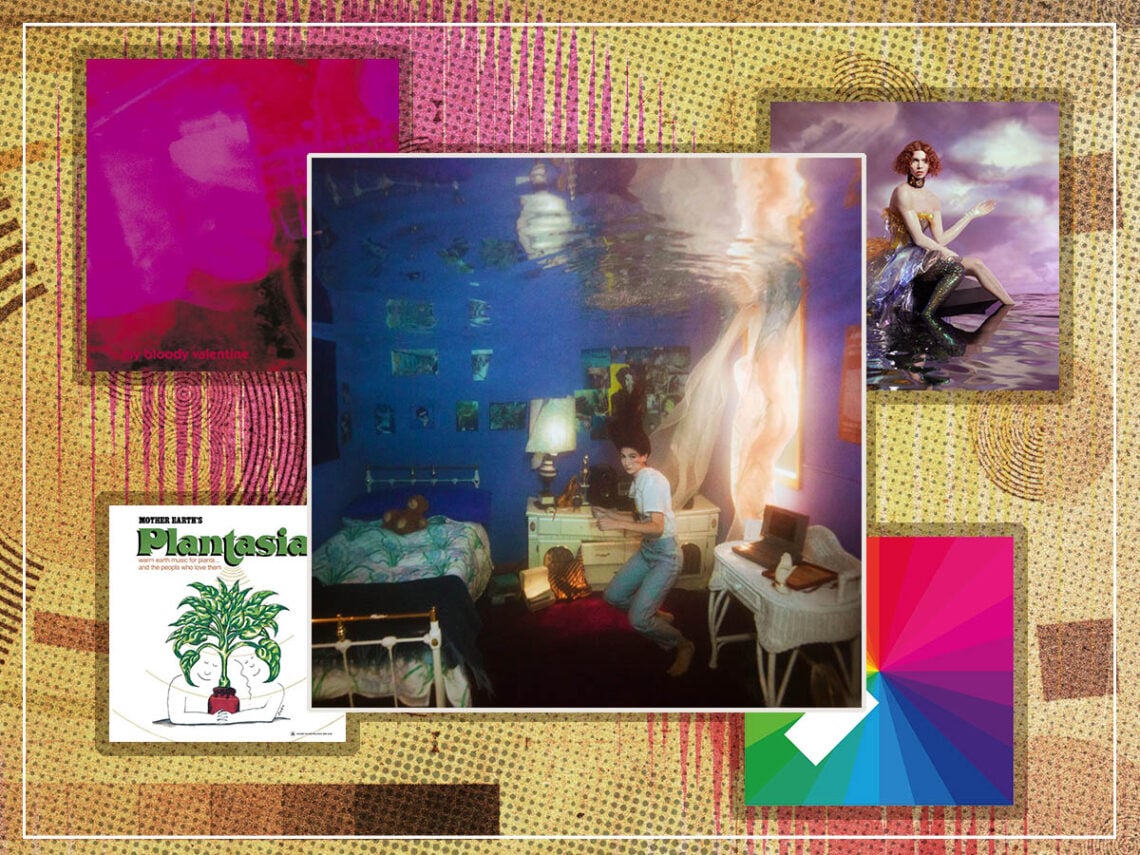
Below, we’ve collated five of our favourite album covers that look just how they sound, from the iconic My Bloody Valentine Loveless cover to SOPHIE’s electronic masterpiece Oil of Every Pearl’s Un-Insides.
Five album covers that reflect the music:
Weyes Blood – Titanic Rising
From its opening track, ‘A Lot’s Gonna Change’, Weyes Blood’s fourth album plunges its audience into an ethereal world of chamber pop. Guiding listeners through themes of modern love, nostalgia, cinema, and climate change, Titanic Rising is one of the most sonically coherent alt-pop albums of the last decade, and its artwork is no different.
Natalie Mering, more commonly known as Weyes Blood, worked with photographer Brett Stanley on the album cover. Discussing the work, she told Stereogum: “It’s kind of like the waters have risen over this bedroom, which to me is symbolic of kind of a subconscious altar that all young people in Western culture create for themselves. This kind of altar for whatever they worship in their sacred space that’s just theirs… The bedroom is an archetype. To me, it stands for a lot of the silliness of our modern culture, where the kind of things that we worship in our sacred spaces are based on media and movies because we don’t really have much else in the way of myths if that makes sense.”
Her most recent album, And In The Darkness, Hearts Aglow, has similarly fitting accompanying artwork, which sees Mering with a glowing heart. She emulated this image on her live tour, which saw her float across the stage with a glowing red light beneath her clothes.

My Bloody Valentine – Loveless
My Bloody Valentine’s Loveless has come to be known as the seminal album of shoegaze. Its fuzzy guitars, layered soundscapes, and whirring noise are reflected in its similarly distorted artwork. The iconic cover shows a bright pink, blurry photo of a guitar.
The band’s name is nearly invisible, in a dark pink colour and shoved into the corner. Like the vocals on Loveless, it blends into the guitar. The album and its artwork have become so recognisable that the typography would be redundant anyway, and Loveless has become synonymous with My Bloody Valentine and with the wider shoegaze genre.

SOPHIE – OIL OF EVERY PEARL’S UN-INSIDES
SOPHIE’s 2018 album OIL OF EVERY PEARL’S UN-INSIDES is a defining album in the hyper-pop genre. Charting her experience as a transgender woman, the album is a futuristic blend of electronica, hyper-pop, industrial, and more. It mixes the harsh and the soft seamlessly, transitioning from emotional tracks like ‘It’s Okay To Cry’ to the noisy experimental ‘Ponyboy’ with ease.
The accompanying artwork fits the album’s sound and ethos perfectly. It pictures SOPHIE herself, floating on a sea of purple water and wearing a dress seemingly made of cellophane. The sky, too, is purple, highlighting SOPHIE with the light through the clouds, and the typography on her arm seems to read ‘NOTHINGNESS’. Combining the ethereal with the plastic and placing SOPHIE right at the centre, the image underlines the album perfectly.

Mort Garson – Mother Earth’s Plantasia
In 1976, Mort Garson released Mother Earth’s Plantasia with the tagline, “warm earth music for plants and the people who love them”. The electronic album gained little recognition or success upon its release but has since gained a cult following for its early use of the Moog synthesiser.
Illustrated by Marvin Rubin, the artwork features two smiling faces illustrated by a singular black line, embracing beneath a detailed, coloured houseplant. The illustration’s simplicity and serenity are matched by the playful calmness of Garson’s record, music which soothes plants and humans alike. The music and the artwork share a nurturing quality. The LP is also accompanied by a book insert with details on how to care for different plans, also illustrated by Rubin and a download card embedded with wildflower seeds.

Jamie XX – In Colour
Producer Jamie XX’s first album, In Colour, was released in 2015, immediately gaining a Mercury Prize nomination and a Grammy nod for its innovative electronica. The album quickly became the youth’s sound of the summer and has retained that label ever since. With each turn of the sunny season, electronic fans turn back to the dependable upbeat, sunny sounds of Jamie XX’s debut.
The artwork, though simplistic, has become just as recognisable and associated with the album. It emulates a colour wheel, displaying 24 different blocks of colours in order with a white rectangle in the bottom left-hand corner. The simplicity of the cover is as pleasing as Jamie XX’s clean production, while the spectrum of colours mirrors the album’s range of samples and influences. The colourful artwork is the perfect accompaniment for Jamie XX’s bright collage of electronica.
Jamie XX released the vinyl edition of the album available in three of the colours from the artwork (purple, orange, and green) as a lucky dip, with customers unable to choose which colour they received.
